前回にログイン認証の実装を行いました。
Djangoでログイン機能の実装
ログイン後の画面を作成して、ログイン状態でないとアクセスできない処理を実装していきます。
画面追加
templatesにpage.htmlを追加してurls.pyで繋ぎ込み、views.pyで表示させていきます。
page.htmlはbootstrapのテンプレートを利用してしまいます。
usrls.py
from django.urls import path, include
from .views import signup, signin, pagefunc

urlpatterns = [
    path('signup/', signup, name='signup'),
    path('signin/', signin, name='signin'),
    path('page/', pagefunc, name='page'),
]
views.py
from django.shortcuts import render, redirect
from django.contrib.auth.models import User
from django.contrib.auth import authenticate, login

def signup(request):
  if request.method == "POST":
    username = request.POST['username']
    email = request.POST['email']
    password = request.POST['password']
    # DB内のユーザー一覧に入力されたユーザー名が含まれているか確認
    try:
      # 合致するユーザーがなければDoesNotExistになる
      # except文に移行して、新規に登録が実行される
      User.objects.get(username=username)
      return render(request, 'signup.html', {'error': 'このユーザーは登録されています'})
    except:
      User.objects.create_user(username, email, password)
  return render(request, 'signup.html', {'number': 100})

def signin(request):
  if request.method == 'POST':
    # usernameを指定します。
    # emailを使用したい場合は、Userモデルをカスタマイズする必要があります
    username = request.POST['username']
    password = request.POST['password']
    # DBに存在するか確認
    user = authenticate(request, username=username, password=password)
    if user is not None:
      login(request, user)
      # renderでも可
      return redirect('page')
    else:
      # 認証失敗時
      return redirect('signin')

  return render(request, 'signin.html')

def pagefunc(request):
  return render(request, 'page.html')
page.html
{% extends 'base.html' %}
{% block customecss %}
{% endblock customecss %}
{% block header %}
<header>
<div class="collapse bg-dark" id="navbarHeader">
<div class="container">
<div class="row">
<div class="col-sm-8 col-md-7 py-4">
<h4 class="text-white">About</h4>
<p class="text-muted">Add some information about the album below, the author, or any other background context. Make it a few sentences long so folks can pick up some informative tidbits. Then, link them off to some social networking sites or contact information.</p>
</div>
<div class="col-sm-4 offset-md-1 py-4">
<h4 class="text-white">Contact</h4>
<ul class="list-unstyled">
<li><a href="#" class="text-white">Follow on Twitter</a></li>
<li><a href="#" class="text-white">Like on Facebook</a></li>
<li><a href="#" class="text-white">Email me</a></li>
</ul>
</div>
</div>
</div>
</div>
<div class="navbar navbar-dark bg-dark shadow-sm">
<div class="container d-flex justify-content-between">
<a href="#" class="navbar-brand d-flex align-items-center">
<svg xmlns="http://www.w3.org/2000/svg" width="20" height="20" fill="none" stroke="currentColor" stroke-linecap="round" stroke-linejoin="round" stroke-width="2" aria-hidden="true" class="mr-2" viewBox="0 0 24 24" focusable="false"><path d="M23 19a2 2 0 0 1-2 2H3a2 2 0 0 1-2-2V8a2 2 0 0 1 2-2h4l2-3h6l2 3h4a2 2 0 0 1 2 2z"/><circle cx="12" cy="13" r="4"/></svg>
<strong>ログイン実装</strong>
</a>
<button class="navbar-toggler" type="button" data-toggle="collapse" data-target="#navbarHeader" aria-controls="navbarHeader" aria-expanded="false" aria-label="Toggle navigation">
<span class="navbar-toggler-icon"></span>
</button>
</div>
</div>
</header>
{% endblock header %}
{% block content %}
<main role="main">
<section class="jumbotron text-center">
<div class="container">
<h1>Album example</h1>
<p class="lead text-muted">Something short and leading about the collection below—its contents, the creator, etc. Make it short and sweet, but not too short so folks don’t simply skip over it entirely.</p>
<p>
<a href="#" class="btn btn-primary my-2">Main call to action</a>
<a href="#" class="btn btn-secondary my-2">Secondary action</a>
</p>
</div>
</section>
<div class="album py-5 bg-light">
<div class="container">
<div class="row">
<div class="col-md-4">
<div class="card mb-4 shadow-sm">
<svg class="bd-placeholder-img card-img-top" width="100%" height="225" xmlns="http://www.w3.org/2000/svg" preserveAspectRatio="xMidYMid slice" focusable="false" role="img" aria-label="Placeholder: Thumbnail"><title>Placeholder</title><rect width="100%" height="100%" fill="#55595c"/><text x="50%" y="50%" fill="#eceeef" dy=".3em">Thumbnail</text></svg>
<div class="card-body">
<p class="card-text">This is a wider card with supporting text below as a natural lead-in to additional content. This content is a little bit longer.</p>
<div class="d-flex justify-content-between align-items-center">
<div class="btn-group">
<button type="button" class="btn btn-sm btn-outline-secondary">View</button>
<button type="button" class="btn btn-sm btn-outline-secondary">Edit</button>
</div>
<small class="text-muted">9 mins</small>
</div>
</div>
</div>
</div>
</div>
</div>
</div>
</main>
<footer class="text-muted">
<div class="container">
<p class="float-right">
<a href="#">Back to top</a>
</p>
<p>Album example is © Bootstrap, but please download and customize it for yourself!</p>
<p>New to Bootstrap? <a href="https://getbootstrap.com/">Visit the homepage</a> or read our <a href="/docs/4.4/getting-started/introduction/">getting started guide</a>.</p>
</div>
</footer>
<script src="https://code.jquery.com/jquery-3.4.1.slim.min.js" integrity="sha384-J6qa4849blE2+poT4WnyKhv5vZF5SrPo0iEjwBvKU7imGFAV0wwj1yYfoRSJoZ+n" crossorigin="anonymous"></script>
<script src="/docs/4.4/dist/js/bootstrap.bundle.min.js" integrity="sha384-6khuMg9gaYr5AxOqhkVIODVIvm9ynTT5J4V1cfthmT+emCG6yVmEZsRHdxlotUnm" crossorigin="anonymous"></script></body>
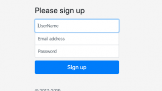
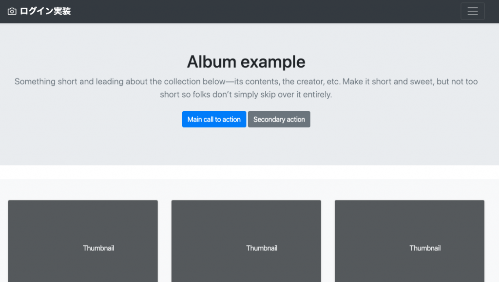
{% endblock content %}これで準備が整いました。一応表示を確認すると下記のようになります。
ログイン判定機能はどのサービスでも必要になってくるので、django側である程度は機能として提供してくれているので、それを利用していきます。
詳しくは公式ドキュメントを参照してください。
https://docs.djangoproject.com/ja/3.0/topics/auth/default/#the-login-required-decorator
ドキュメントをみていただくと分かりますが、実装の仕方はとてもシンプルです。
views.pyでモジュールを読み込んで、関数の前にデコレーターを指定してあげるだけです。
デコレーターはpythonの分野なので、ここでは解説しませんが、ある関数を実行する前に、処理を走らせる機能と思っていてください。
それでは実装していきます。
views.py
from django.shortcuts import render, redirect
from django.contrib.auth.models import User
from django.contrib.auth import authenticate, login
from django.contrib.auth.decorators import login_required

def signup(request):
  if request.method == "POST":
    username = request.POST['username']
    email = request.POST['email']
    password = request.POST['password']
    # DB内のユーザー一覧に入力されたユーザー名が含まれているか確認
    try:
      # 合致するユーザーがなければDoesNotExistになる
      # except文に移行して、新規に登録が実行される
      User.objects.get(username=username)
      return render(request, 'signup.html', {'error': 'このユーザーは登録されています'})
    except:
      User.objects.create_user(username, email, password)
  return render(request, 'signup.html', {'number': 100})

def signin(request):
  if request.method == 'POST':
    # usernameを指定します。
    # emailを使用したい場合は、Userモデルをカスタマイズする必要があります
    username = request.POST['username']
    password = request.POST['password']
    # DBに存在するか確認
    user = authenticate(request, username=username, password=password)
    if user is not None:
      login(request, user)
      # renderでも可
      return render(request, 'signup.html')
    else:
      # 認証失敗時
      return redirect('signin')

  return render(request, 'signin.html')

@login_required
def pagefunc(request):
  return render(request, 'page.html')
これだけで、ログイン判定ができました。
ただ、これだけだとログインしていない場合のリダイレクト先が設定されていないので、settings.pyにLOGIN_URLという変数を設定して、飛び先を指定してあげます。
# ... ここまでに他の設定が書かれている ...

LOGIN_URL = 'signin'ここまでできたら、ログインしている状態とそうでない状態で、http://localhost:8000/page/ にアクセスしてログイン判定が正常に働いているかのチェックをしてみてください。
これでログイン状態を判定する機能の実装が完了しました。
おまけ
ログアウト実装
ログイン機能を実装したなら、ログアウト機能も必要になってきますよね。
そこで、ログアウトを実装するのも簡単なので、紹介します。
ドキュメントはログイン判定のURLと同じページに載っています。
それでは実装していきます。ログアウトは別リンクで実行するので、別の関数を作り、urls.pyにもログアウト用のパスを記載します。
views.py
from django.shortcuts import render, redirect
from django.contrib.auth.models import User
from django.contrib.auth import authenticate, login, logout
from django.contrib.auth.decorators import login_required

# ... ここまでに他の設定が書かれている ...

def logoutfunc(request):
    logout(request)
urls.py
from django.urls import path, include
from .views import signup, signin, pagefunc, logoutfunc

urlpatterns = [
    path('signup/', signup, name='signup'),
    path('signin/', signin, name='signin'),
    path('page/', pagefunc, name='page'),
    path('logout/', logoutfunc, name='logout'),
]
これで設定は完了したので、ログアウトできるか確認するためのボタンをpage.htmlに設置します。設置する場所はheader部分にしてきます。
{% block header %}
<header>
  <div class="collapse bg-dark" id="navbarHeader">
    <div class="container">
      <div class="row">
        <div class="col-sm-8 col-md-7 py-4">
          <h4 class="text-white">About</h4>
          <p class="text-muted">Add some information about the album below, the author, or any other background context. Make it a few sentences long so folks can pick up some informative tidbits. Then, link them off to some social networking sites or contact information.</p>
        </div>
        <div class="col-sm-4 offset-md-1 py-4">
          <h4 class="text-white">Contact</h4>
          <ul class="list-unstyled">
            <li><a href="{% url 'logout' %}" class="text-white">ログアウト</a></li>
          </ul>
        </div>
      </div>
    </div>
  </div>
  <div class="navbar navbar-dark bg-dark shadow-sm">
    <div class="container d-flex justify-content-between">
      <a href="#" class="navbar-brand d-flex align-items-center">
        <svg xmlns="http://www.w3.org/2000/svg" width="20" height="20" fill="none" stroke="currentColor" stroke-linecap="round" stroke-linejoin="round" stroke-width="2" aria-hidden="true" class="mr-2" viewBox="0 0 24 24" focusable="false"><path d="M23 19a2 2 0 0 1-2 2H3a2 2 0 0 1-2-2V8a2 2 0 0 1 2-2h4l2-3h6l2 3h4a2 2 0 0 1 2 2z"/><circle cx="12" cy="13" r="4"/></svg>
        <strong>ログイン実装</strong>
      </a>
      <button class="navbar-toggler" type="button" data-toggle="collapse" data-target="#navbarHeader" aria-controls="navbarHeader" aria-expanded="false" aria-label="Toggle navigation">
        <span class="navbar-toggler-icon"></span>
      </button>
    </div>
  </div>
</header>
{% endblock header %}
以上でログアウトの実装が完了しました。